CSS Overlay
CSS Overlay
A CSS overlay is a styling technique where a semi-transparent layer is placed over an element—often an image or background—to dim it and make the foreground content, such as text, stand out more clearly.
Overlay of an image
A common use case is placing text or a colored layer on top of an image:
<div class="image-container">
  <img src="https://images.unsplash.com/photo-1592859600972-1b0834d83747?q=80&w=2340&auto=format&fit=crop&ixlib=rb-4.1.0&ixid=M3wxMjA3fDB8MHxwaG90by1wYWdlfHx8fGVufDB8fHx8fA%3D%3D" alt="Photo">
  <div class="overlay">Some text</div>
</div>
.image-container {
  position: relative;
  display: inline-block;
  width: 30%;
}

.image-container img {
  display: block;
  width: 100%;
}

.overlay {
  position: absolute;     /* Positioned relative to parent */
  top: 0;
  left: 0;
  width: 100%;
  height: 100%;
  background: rgba(0,0,0,0.7);
  color: white;
  display: flex;          /* Center text */
  align-items: center;
  justify-content: center;
  font-size: 2.0em;
}
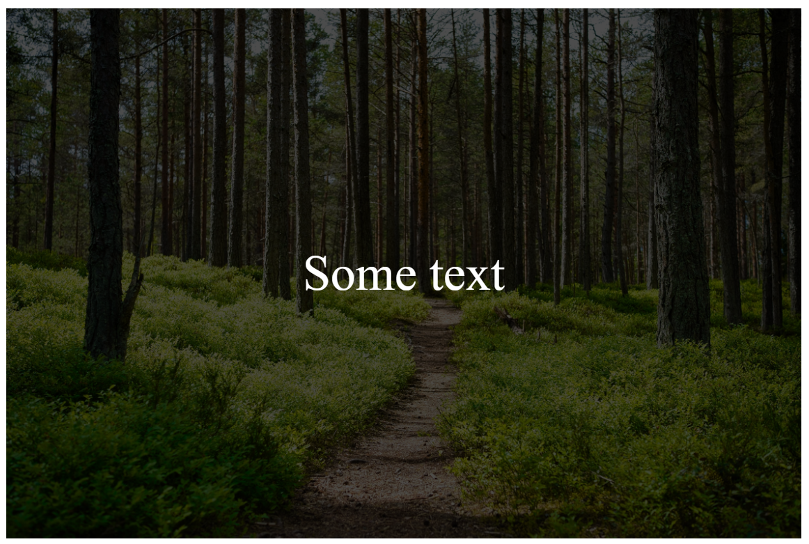
The background uses rgb(0,0,0) with an alpha value of 0.7, making it semi-transparent. If the alpha value were 1.0, it would be fully opaque. The text overlaps the image because the .overlay element is set to position: absolute, which positions it relative to its parent container.
This is result for alpha 0.7:
This is result for alpha 0.0:
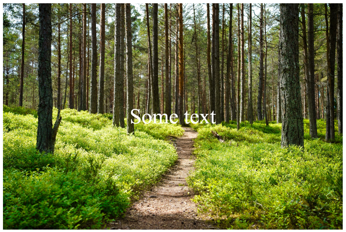
As you can see, the text becomes clearer when an alpha value is applied.
Using overlay to create modal
An overlay is useful when creating a modal.
This is an example code
<img src="https://images.unsplash.com/photo-1592859600972-1b0834d83747?q=80&w=2340&auto=format&fit=crop&ixlib=rb-4.1.0&ixid=M3wxMjA3fDB8MHxwaG90by1wYWdlfHx8fGVufDB8fHx8fA%3D%3D">
<div class="overlay">
  <div class="modal">
    <h2>Modal Title</h2>
    <p>This is a modal window with an overlay background.</p>
    <div class="actions">
      <button class="btn cancel">Cancel</button>
      <button class="btn ok">OK</button>
    </div>
  </div>
</div>
img {
  position: relative;
  width: 100%;
}
/* Overlay background */
.overlay {
  position: fixed;
  top: 0;
  left: 0;
  width: 100%;
  height: 100%;
  background: rgba(0,0,0,0.6);
  display: flex;               /* Always visible (for demo) */
  align-items: center;
  justify-content: center;
  z-index: 999;
}

/* Modal box */
.modal {
  background: #fff;
  padding: 25px 30px;
  border-radius: 12px;
  max-width: 400px;
  width: 90%;
  text-align: center;
  box-shadow: 0 10px 25px rgba(0,0,0,0.3);
  font-family: sans-serif;
}

/* Buttons */
.actions {
  margin-top: 20px;
  display: flex;
  justify-content: center;
  gap: 15px;
}

.btn {
  padding: 8px 16px;
  border-radius: 6px;
  border: none;
  cursor: pointer;
  font-weight: bold;
}

.btn.cancel {
  background: #ddd;
  color: #333;
}

.btn.ok {
  background: #4CAF50;
  color: white;
}
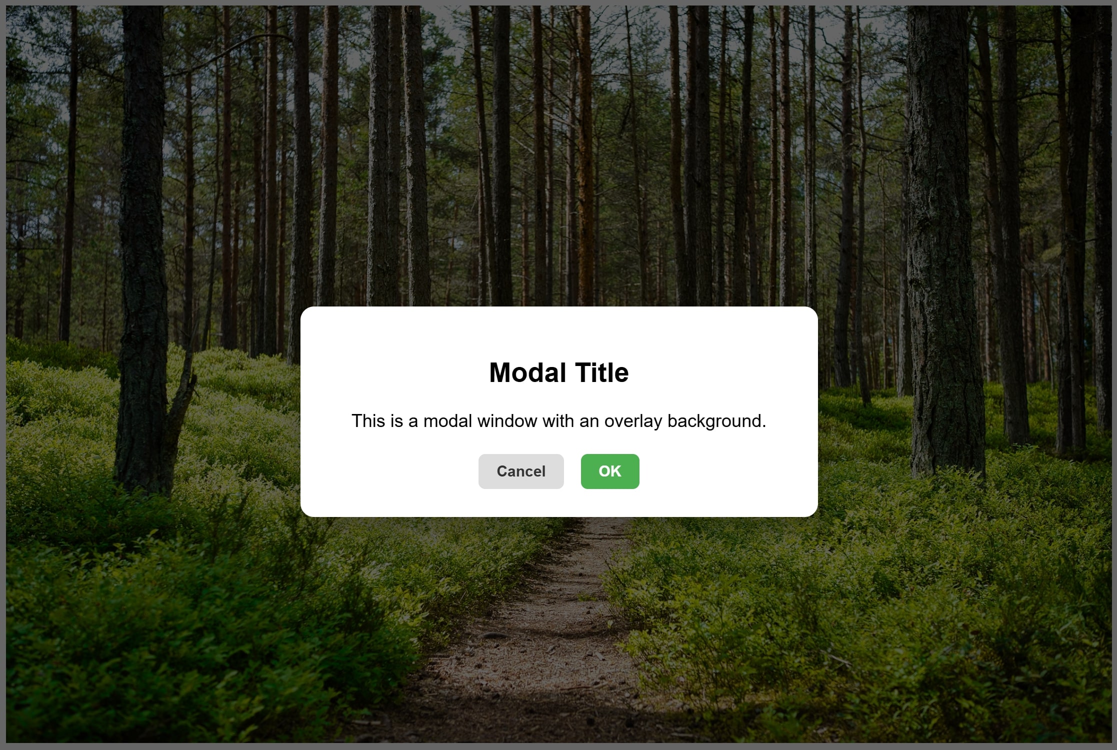
In .overlay, the property background: rgba(0,0,0,0.6); is the key part that creates the overlay effect. With position: fixed;, the .overlay stays in place even when the page is scrolled, since it’s positioned relative to the viewport rather than its parent.
This is the output:
AI-generated Content Disclaimer
Some portions of this text were created with the assistance of AI language models. While effort has been made to ensure accuracy, the content may contain errors or incomplete information. Please use your own judgment and verify details when necessary.
